Shopify UI
The Shopify Connector allows you to connect your Shopify company to Constructor. It provides Liquid UI components out of the box that can speed up your integration by dragging and dropping these components to your store.
Under the hood, the liquid components leverage Constructor's UI Libraries, which means they should provide the same functionality found in each UI library.
Step 1: Install the Constructor Connect app
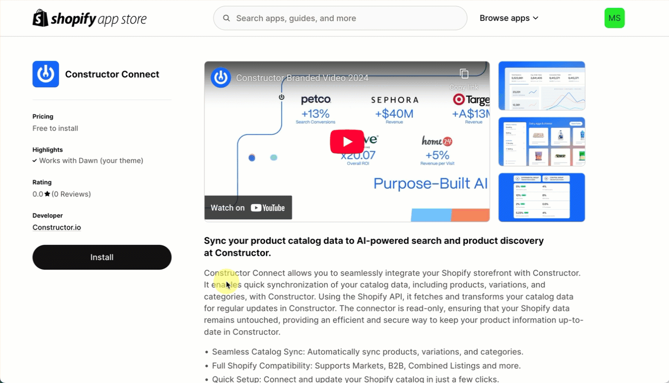
- Navigate to the Shopify App Store.
- Search Constructor Connect in the search field at the top of the page. Alternatively, visit the Constructor Connect app page.
- On the Constructor Connect app page, select Install.
- You will be redirected to your store. On the pop-up, review permissions, then select Install in the bottom-right corner.
Step 2: Load the beacon
The easiest way to load our beacon using Shopify is through our App Embed theme extension.
After installing the app, follow these steps:
- Select Online Store in the side menu of your Shopify Store Admin.
- Locate your current theme and select Customize on the left side of the page.
- Click on App Embeds, and enable the Constructor Beacon.
- Fill your Bundle Name to ensure your beacon is loading correctly.
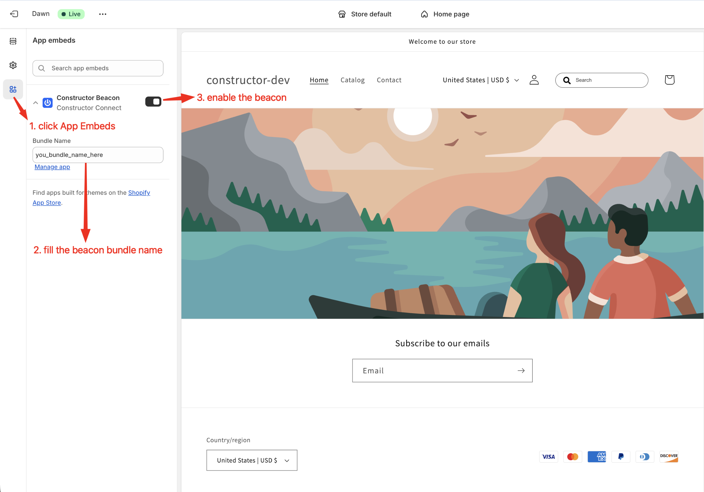
Enabling the beacon
Step 3: Customize your store
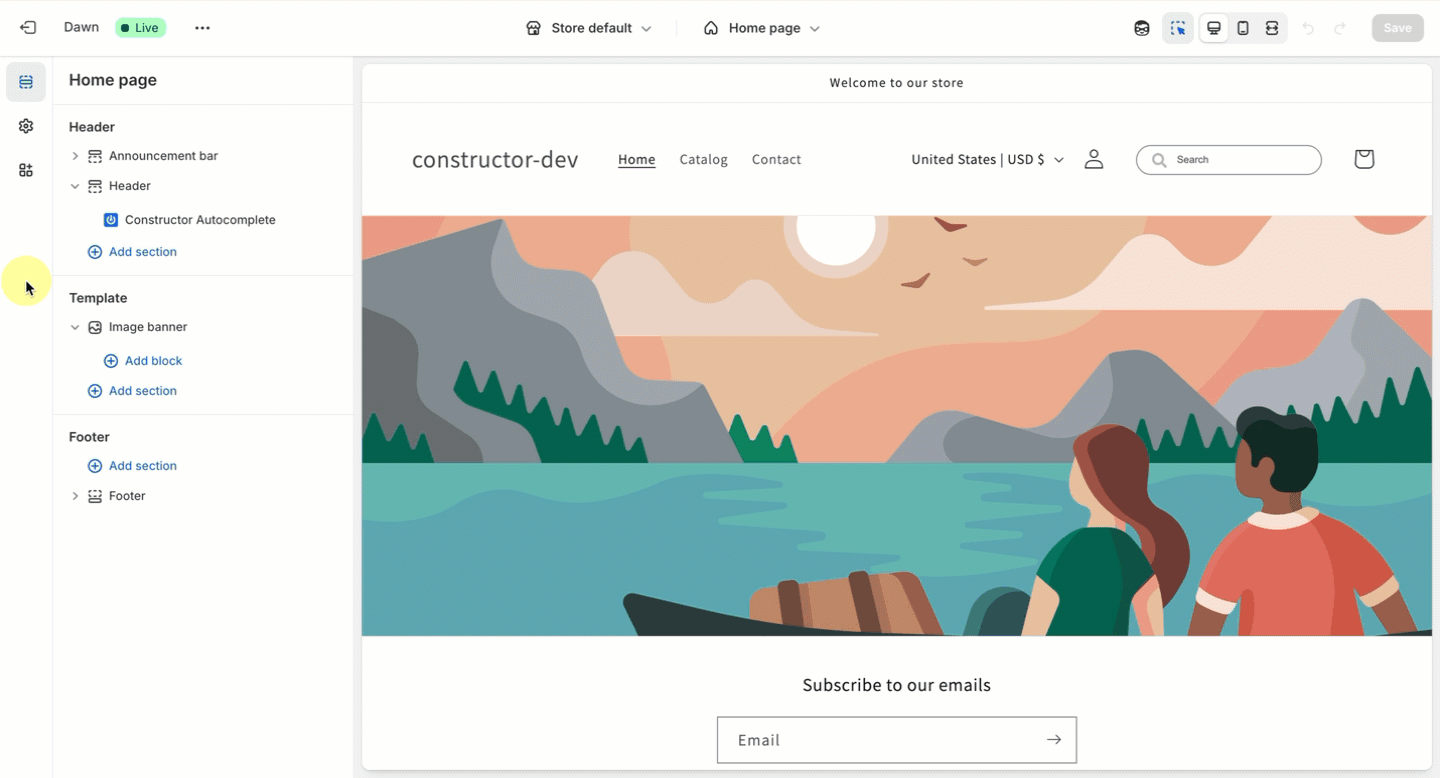
- Select Online Store in the side menu of your Shopify Store Admin.
- Locate your current theme and select Customize on the left side of the page.
- Note: Liquid components should be compatible with any theme; however, you may need to add custom CSS to style the elements based on your needs.
- On the left side of the theme editor, select + Add section in the part of the theme where you wish to add a component.
- On the pop-up, select Apps beneath the search field, then select your desired Constructor component.
- Expand the new Apps section in the theme editor to view the component. You can now drag and drop the component to the ideal location on the page.
Autocomplete UI
The Constructor Autocomplete liquid component renders the Autocomplete UI element. It provides the search bar, incorporating Constructor's Autocomplete product.
This element can be rendered anywhere; however, adding it to the Header section allows you to override the native Shopify search field.
Constructor Autocomplete liquid component
Once added, select the Constructor Autocomplete component in the theme editor to access the following configuration options:
| Option | Description |
|---|---|
| Autocomplete UI Version | The Autocomplete UI library version, as seen on npm. |
| Constructor Index Key | The Constructor index key to use. |
| Search URL | The search URL to redirect to when clicking on a search suggestion. |
| Enable default CSS? | If enabled, it will apply default CSS styles to make the UI look nicer. |
| Override default search icon? | If enabled, it will hide the Shopify native search icon and position itself in the header where the search icon is normally found. |
| Options (JSON) | A JSON string allowing you to input any additional options available in the UI library. |
PLP UI
The Constructor PLP liquid component renders the PLP UI element. It handles the entire product list page, covering Constructor's Search and Browse products.
While this element can be rendered anywhere, we recommend that it be rendered inside the Template section as this is the main page body where users would expect to see the list of products.
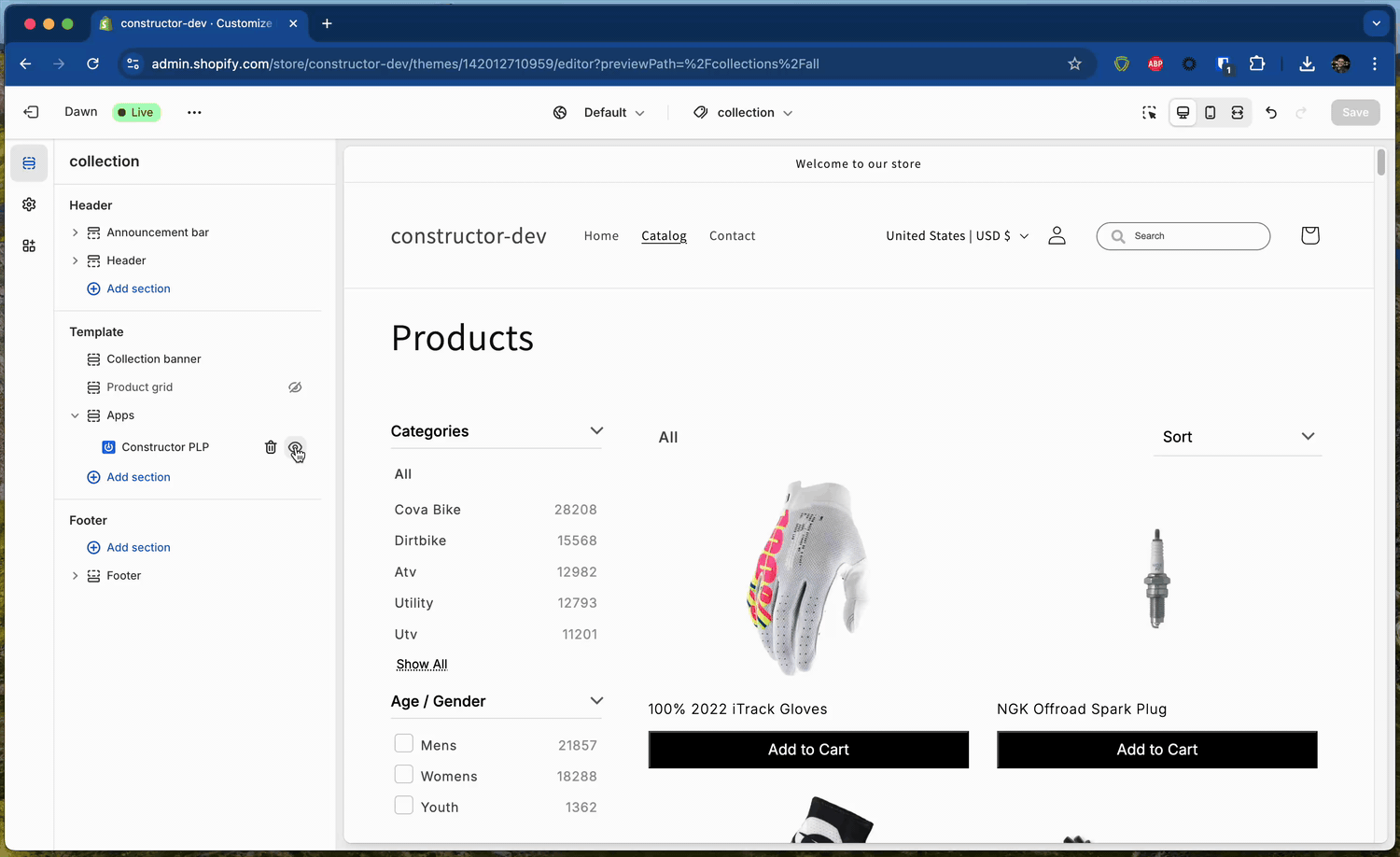
Constructor PLP liquid component
Once added, select the Constructor PLP component in the theme editor to access the following configuration options:
| Option | Description |
|---|---|
| PLP UI Version | The PLP UI library version, as seen on npm. |
| Constructor Index Key | The Constructor index key to use. |
| Enable default CSS? | If enabled, it will apply default CSS styles to make the UI look nicer. |
| Options (JSON) | A JSON string allowing you to input any additional options available in the UI library. |
Recommendations UI
The Constructor Recommendations liquid component renders the Recommendations UI element. It handles the recommendations carousel, covering Constructor's Recommendations product..
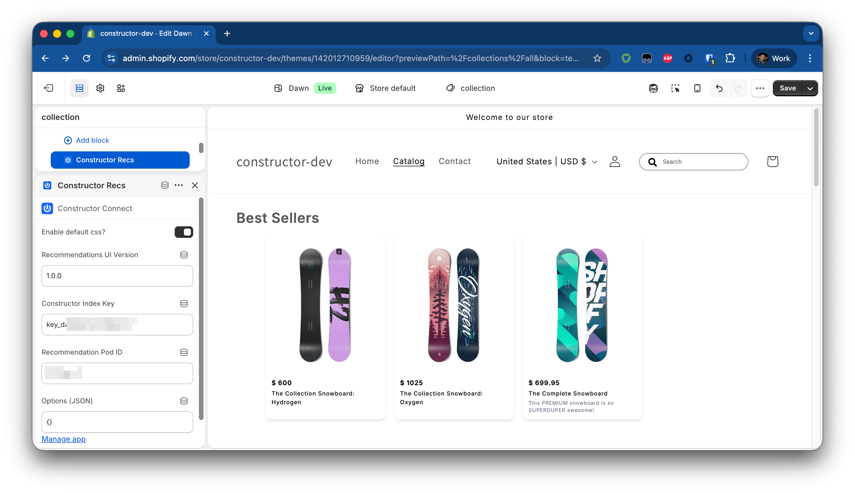
Once added, select the Constructor Recs component in the theme editor to access the following configuration options:
| Option | Description |
|---|---|
| Recommendations UI Version | The Recommendations UI library version, as seen on npm. |
| Constructor Index Key | The Constructor index key to use. |
| Enable default CSS? | If enabled, it will apply default CSS styles to make the UI look nicer. |
| Options (JSON) | A JSON string allowing you to input any additional options available in the UI library. |
Updating UI library versions
Once you've added a liquid component and want to update the UI library version, simply go to the component options and change the {Name} UI Version configuration to set the desired version, always according to the npm page for that specific UI library.