Performance
The Performance tab in the Integration section of the Constructor dashboard provides statistics for Autosuggest, Search, Browse and Recommendations used for performance monitoring.
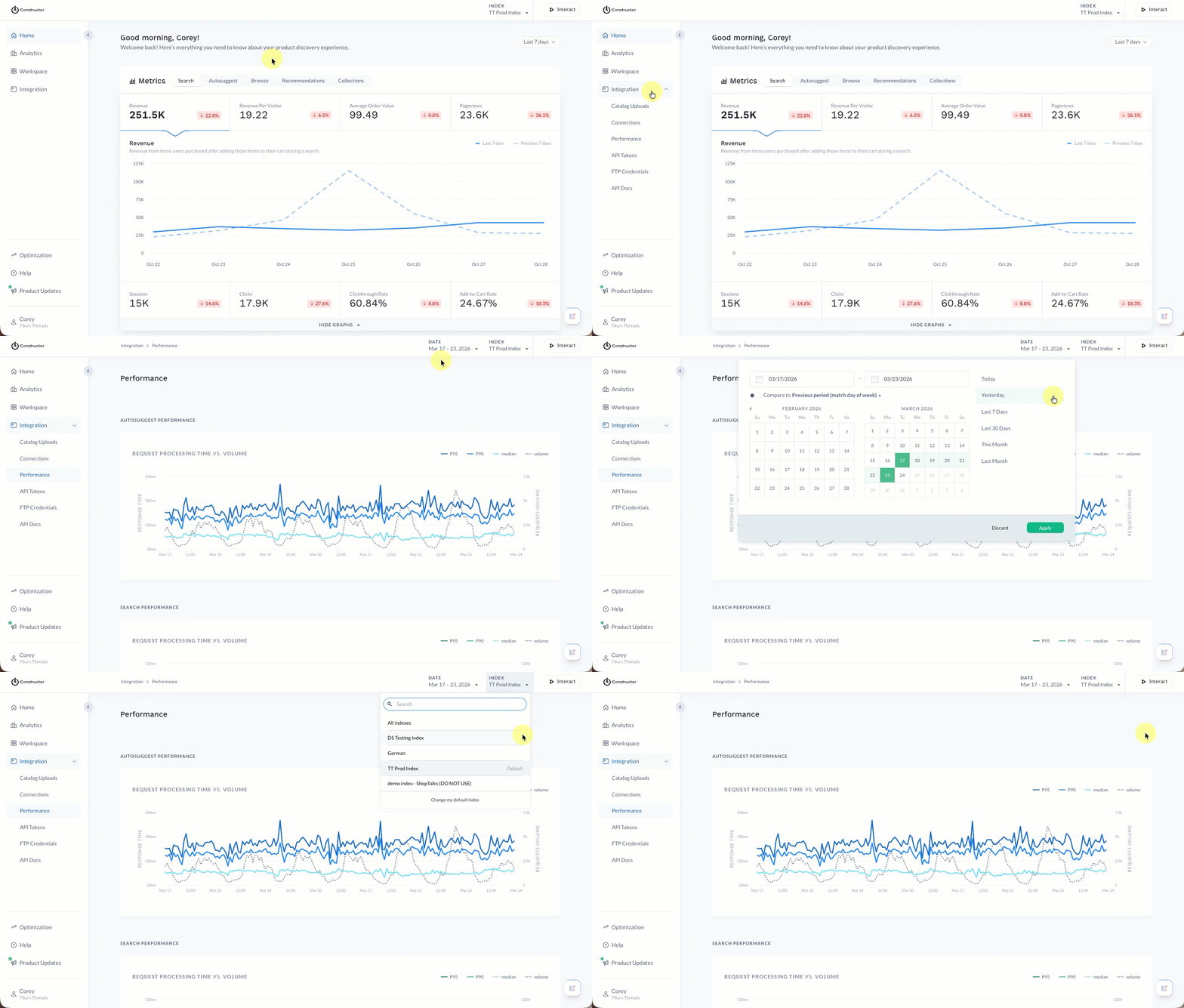
Navigate to Performance

- Select Integration in the side menu of the Constructor dashboard, then select Performance.
- Select Date in the top-right corner of the page to select a specific date range to view. Options include entering specific start and end dates, selecting date tiles, or choose pre-defined dates (e.g., Yesterday, Last 30 Days, etc.).
- Select Index in the top-right corner of the page to select the index for which you wish to view performance.
Interpret request processing time vs volume graph
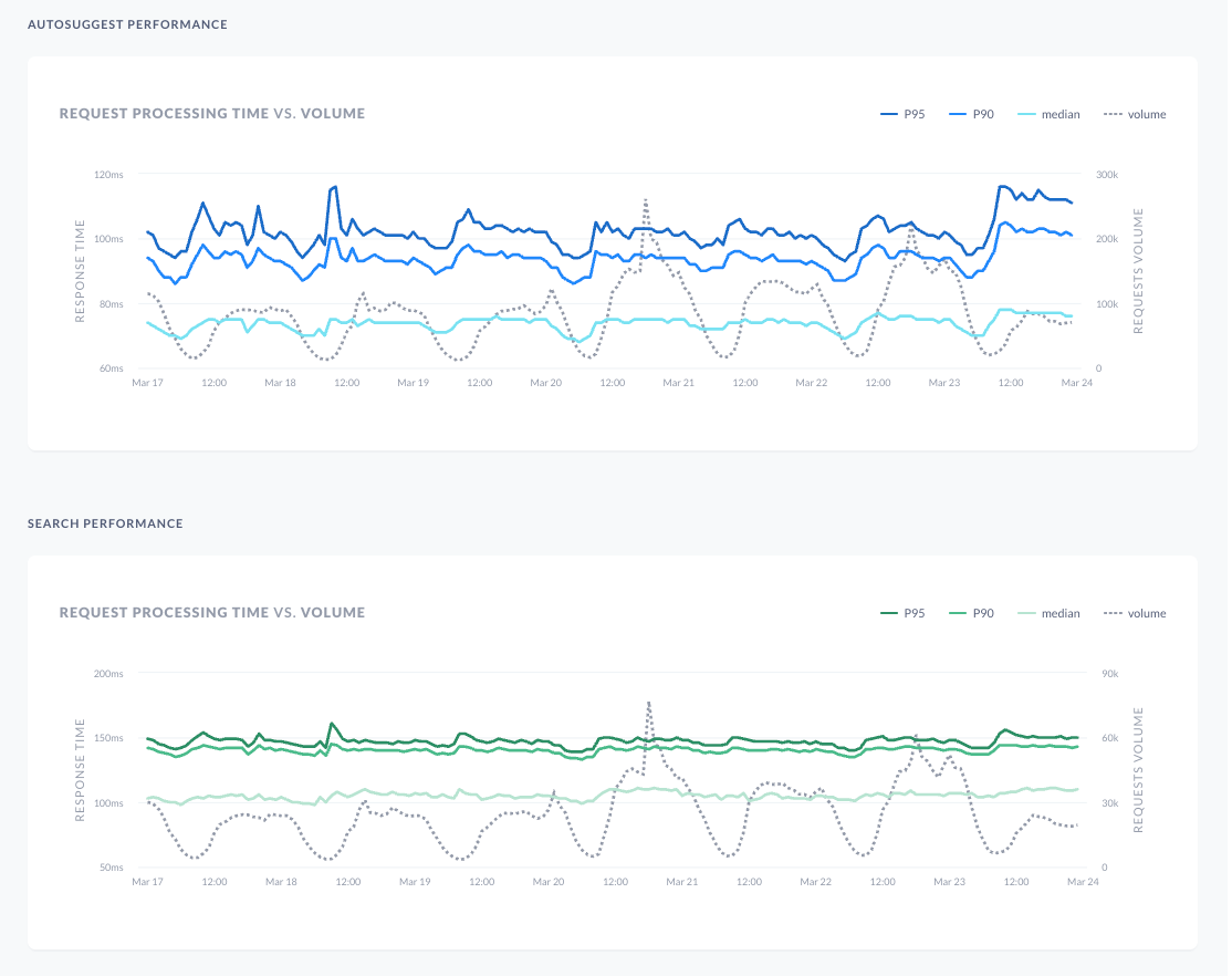
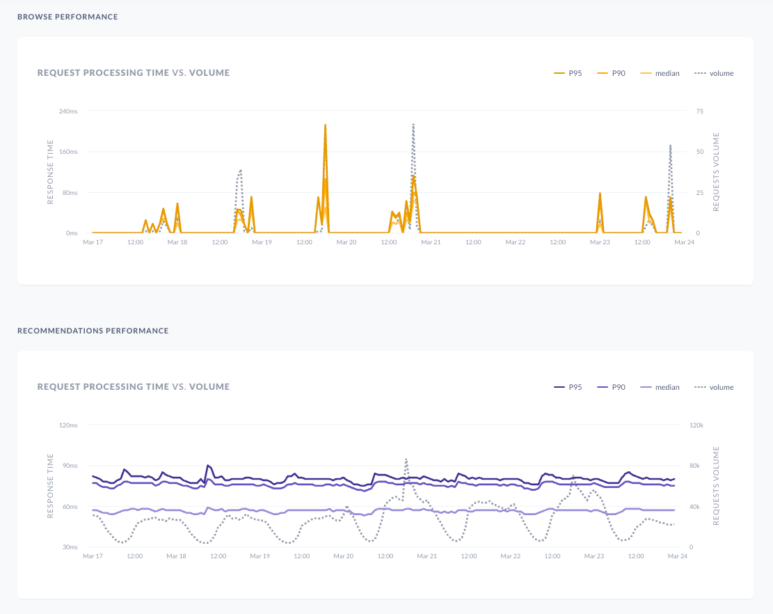
A line graph containing Response Times is overlaid on top of Requests Volume along the date range selected. There are separate graphs for Autosuggest, Search, Browse and Recommendations.
- X-axis is Response Times (measured in milliseconds) and Request Volumes
- Y-axis: Your selected date range.


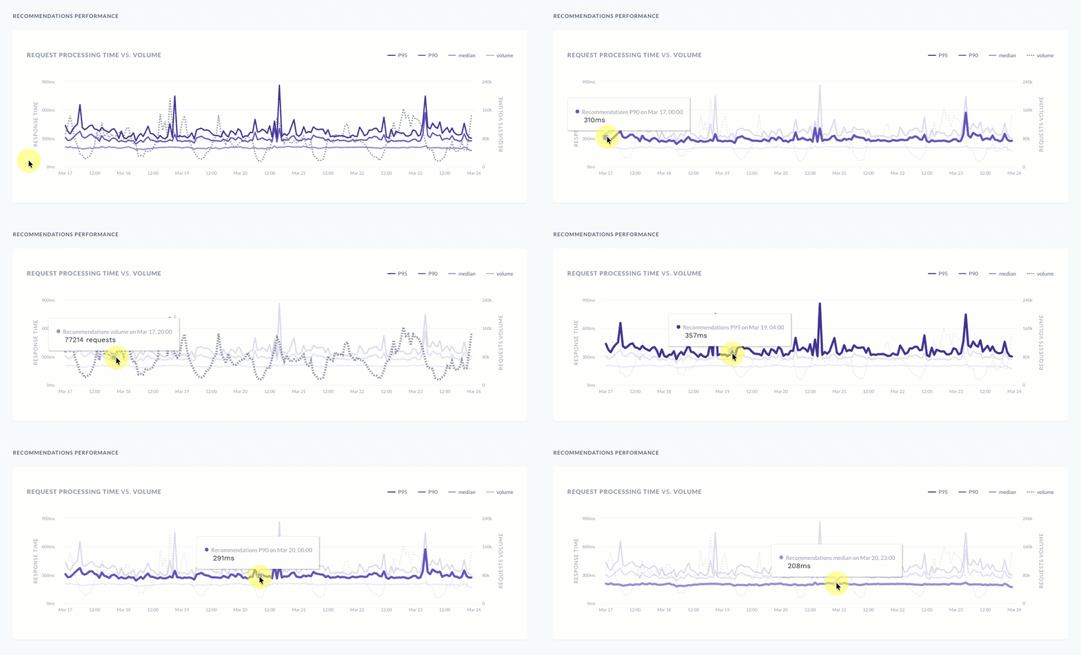
Hovering over each line will give you either percentile (P95, P90), median, and the total volume of requests.

Updated about 2 months ago